


Reading time: approximately 5 minutes
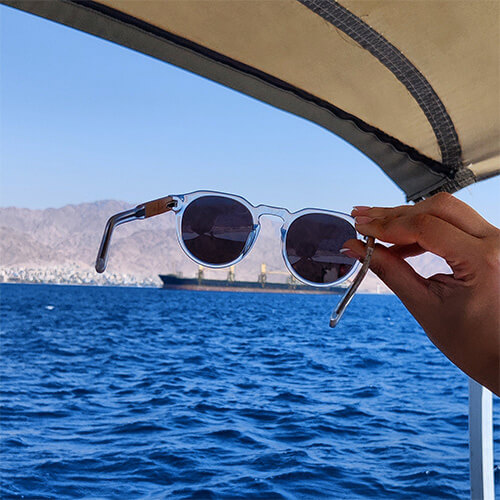
Stone color is the first thing visible on a wrist, but it interacts differently depending on your skin tone, your clothing, and the light. A color that looks rich outdoors can look flat under office lighting.
What Are the Main Bracelet Stone Color Trends?
Beaded bracelet color trends have followed two parallel tracks. The first is a deepening of the dark earth tone palette that’s been building in menswear – more black, more dark brown, more forest green, more deep navy. The second is a broader opening to saturated color in accessories specifically, even among people who keep their clothing neutral.
The logic is clear: if your clothing is navy, grey, white and black, a lapis lazuli bracelet with its deep blue and gold flecking is the one color element in the outfit. Accessories become the place where color enters an otherwise neutral wardrobe. Both tracks favor natural stone over synthetic or dyed beads – the depth and variation of genuine gemstone color is visually richer than any uniform synthetic color.
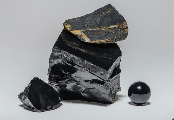
Which Dark Neutral Stones Work Best?
Black onyx remains the single most popular bracelet stone. Its position as a universal neutral means it doesn’t go in or out of trend – it simply works, season after season. What shifted is how onyx is being combined. The trend moved toward pairing onyx with other dark materials – ebony wood, dark sandalwood, grey hematite – to create tonal stacks where all pieces are dark but each has a different surface character. Smooth polished onyx next to fine-grained dark wood next to metallic grey hematite: three shades of dark, three different textures.
Hematite gained ground as a standalone and stacking stone. Its dark metallic grey reads as industrial and minimal in a way that aligns with the broader menswear aesthetic. For more on hematite specifically, see the hematite bracelet guide.
Have Blue Stones Gone Mainstream?
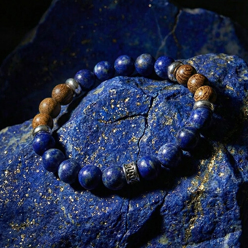
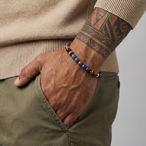
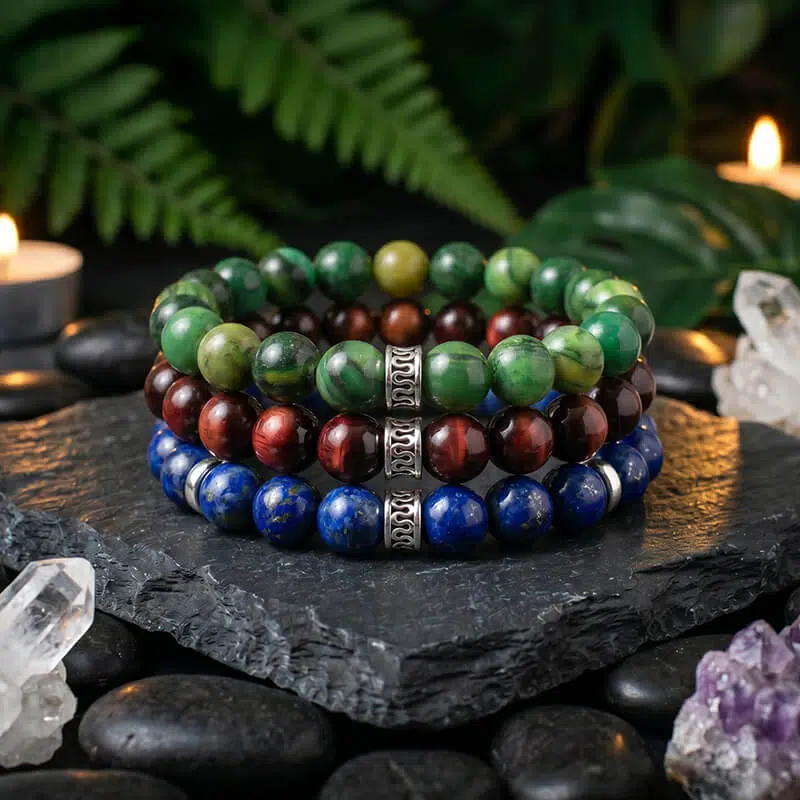
Lapis lazuli, sodalite and blue tiger eye all moved from specialty to mainstream. Lapis lazuli drove most of the movement – its deep ultramarine blue with gold pyrite flecking is visually distinctive and rich, and its depth of association in jewelry history gives it weight that trend-driven synthetic stones don’t carry. Sodalite is a darker, more muted blue-grey – good for people who want blue but not the full boldness of deep lapis. Blue tiger eye (hawk’s eye) is the most subtle of the three, with a dark teal-blue chatoyant quality.
All three pair best with neutral clothing – white, cream, navy, grey, black. From the collection: the Lapis and Zebrawood 6mm; the Lapis and Zebrawood Premium; the Blue Tiger Eye and Yellow Wood.
Where Do Green Stones Fit?
Green stones followed blue into wider mainstream acceptance, building on a multi-year trend toward earth-tone palettes in clothing and accessories. Aventurine pairs cleanly with white, navy and light grey – widely worn combinations that helped it cross from specialty to everyday accessory territory. Malachite remained the bolder choice: its intense dark green with high-contrast banding works best for people confident choosing an accessory that draws attention. From the collection: the Malachite and Black Agate; the Malachite and Black Onyx.
What About Amber and Earth Tones?
Tiger eye held its position as the dominant amber-earth tone stone. See the tiger eye collection page for the full range of tiger eye combinations. Alongside tiger eye, jasper – in its various earth-tone expressions including red jasper, picture jasper and ocean jasper – also gained ground as a more textured, varied alternative. The Red Jasper and Rosewood bracelet is a strong combination in this palette.
| Color Category | Key Stones | Best Worn With |
|---|---|---|
| Dark neutral | Onyx, hematite, ebony | Any wardrobe |
| Blue | Lapis, sodalite, blue tiger eye | Neutrals, white, navy |
| Green | Aventurine, malachite, jade | White, navy, tan, denim |
| Amber / earth | Tiger eye, jasper, wood | Earthy tones, denim, casual |
| White / minimal | Howlite, moonstone, quartz | Light palettes, stacking spacer |
How Do You Stack Bracelets by Color Logic?
When combining multiple bracelets, color logic becomes more important than any single-piece choice. The most reliable stacking logic is tonal: all pieces within the same color family at different values. Three dark stones (onyx, hematite, dark wood) create a deep, unified stack. Three earth tones (tiger eye, sandalwood, jasper) create a warm, organic stack. The interest comes from texture and material variation, not color contrast.
The second reliable approach is anchor plus accent. One piece is the dominant stone in a neutral or earth tone. A second piece provides a color note. A third piece ties them together. Black onyx anchor, lapis accent, dark wood connector: each piece has a clear role in the stack.
Worth Considering
Turquoise and Zebrawood – the teal-to-blue tone of turquoise sits between the blue and earth-tone palettes, making it one of the most flexible color choices.
Browse the full men’s collection and women’s collection – all pieces use natural gemstone, not dyed or synthetic beads.
Mr. Woodini was founded in 2018. We design eco-accessories built from materials with a story – recycled wood temples, natural stone beads, handcrafted construction. Our guides are written from direct experience: sourcing stones, testing daily wear, and building pieces by hand. Learn more about us.
Questions About Bracelet Stone Colors
Black onyx is the most universally compatible – a true neutral that works with any wardrobe direction. Tiger eye is the second most versatile, adding warmth without competing with clothing color. Both work from casual to smart-casual contexts.
Focus on how you wear it rather than what you’re wearing. One piece versus a stack, sleeve up or down, opposite wrist or same wrist as a watch – the same bracelet reads differently depending on how it’s worn. Neutral stone quality matters more than staying current with color trends.
Two reliable approaches: tonal (all pieces in the same color family at different values – three darks, three earth tones) or anchor-plus-accent (one neutral piece, one color piece, one connector that shares qualities with both). The tonal approach is easier; anchor-plus-accent creates more visual interest.
Natural stone versus dyed synthetic, genuine elastic cord, clean construction with no loose beads. A quality piece improves with age – the stone develops character, the wood grain deepens. A trend piece made from synthetic materials degrades within months.